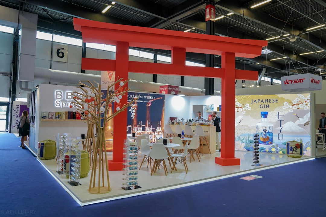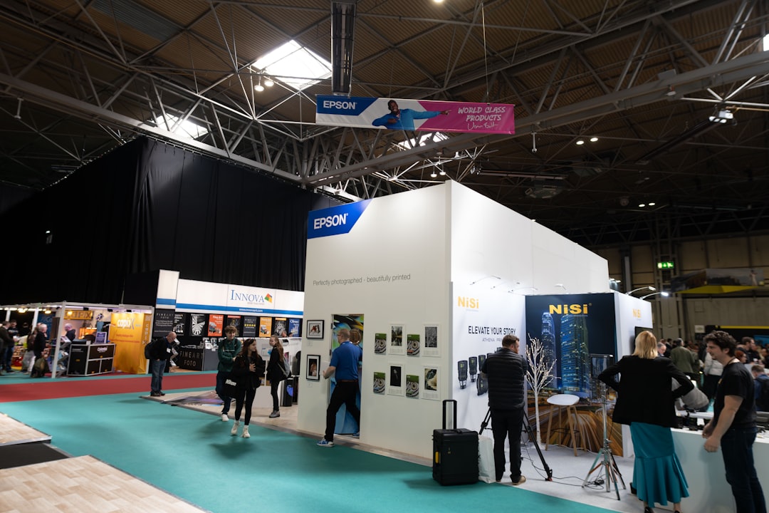
An exhibition stand graphics checklist exists because the graphics on a stand carry the brand message that visitors register first and remember last. Yet stand graphics design routinely starts too late, runs without enough structure, and arrives at print production with artwork that the print process subtly degrades along the way. The result, across thousands of European stand projects annually, is graphics that look good in the design proposal but read inconsistently on the show floor.
This checklist walks through the complete graphics workflow for European exhibition stands: from brief through artwork preparation, print specification, proofing, production, install, and post-fair documentation. It is calibrated for 2026 European fair calendars and reflects the practices of stand-builder graphics teams that consistently deliver brand-integrity outcomes across multiple fairs annually.
The argument: graphics quality is a process discipline, not a creative inspiration. Stands that follow the workflow below deliver predictable, high-quality results regardless of which builder executes the project. Stands that skip stages of the workflow accept inconsistent quality regardless of how much money they spend.
Stage 1: The brief, what to specify before any design begins
The graphics brief should be written before stand design begins, not after. Eight specifications belong in the initial brief.
The first is the brand colour reference system. Specify Pantone numbers, RGB values for screen reference, CMYK values for print reference, and any brand-specific colour notes. The brand guidelines document should be attached to the brief.
The second is the typography and font specification. List approved fonts with weights and files attached. Sub-specify minimum legibility sizes for each viewing distance (typically 30mm character height for 5-metre viewing, 60mm for 10-metre, 120mm for 20-metre).
The third is the photography and imagery library. Reference the brand’s image library, specify which images can be used at exhibition scale, and identify any images that have specific usage rights or restrictions.
The fourth is the messaging hierarchy. Define what visitors should read first (hero statement), second (sector or category positioning), third (product or service detail), and fourth (call-to-action or contact information). Stand graphics that don’t have an explicit messaging hierarchy produce stands where visitors don’t know what to read first.
The fifth is the fair-specific positioning. The same brand may position differently at IFA Berlin (consumer technology) versus Hannover Messe (industrial B2B) versus Salone del Mobile (design buyers). The brief should clarify the fair-specific positioning rather than defaulting to corporate generic.
The sixth is the surface inventory. List every graphic surface in the stand design with dimensions, viewing distance, function, and which messaging hierarchy level applies. This prevents surfaces from being assigned content that doesn’t fit their function.
The seventh is the technology preference. Specify which graphic technologies (fabric SEG, backlit, vinyl, rigid printed) for which surfaces. Without this specification, builders default to their preferred technology for the stand type, which may not match the brand’s preference. The /booth-design/graphics-and-large-format-print/exhibition-stand-graphics-cost-and-specifications-2026 guide covers technology selection in depth.
The eighth is the budget allocation. Specify the percentage of total stand budget allocated to graphics (typically 14-22%) and any sub-allocations within graphics (hero surfaces, accent graphics, signage). This prevents builders from over- or under-investing in specific graphic areas relative to the stand’s overall design intent.
“Graphics briefs that arrive at the builder as a one-page list of brand colours and a logo file produce graphics that look generic. Graphics briefs that specify the eight elements above produce graphics that feel intentional. The difference is visible at the show floor.”, Common framing within FAMAB graphics working groups, 2024-2025
Stage 2: Design, translating brief into artwork
Graphics design follows from brief and integrates with the broader stand design. Five design specifications belong in the design phase.
Layout proofs at scale. Every graphic surface should be designed to its actual dimensions, not at a generic aspect ratio. Layouts at the wrong dimensions produce graphics that don’t scale properly at print and require last-minute redesign.
Type sizing per viewing distance. Apply the minimum legibility sizes from the brief to every text element. Type that is legible at 1-metre design view but illegible at 10-metre stand view produces graphics that don’t work at the fair.
Bleed and safe-zone allocation. Print production requires bleed (typically 5-10mm extending beyond the visible edge) and safe zone (typically 10-20mm inside the visible edge where critical content stays). Design that ignores bleed and safe zone produces graphics where edges get cut off in production.
Image resolution at final scale. Photography used at exhibition scale must have native resolution sufficient for 1:1 reproduction at the target print resolution. A 4000-pixel-wide image looks fine at screen size but produces obviously pixelated print at 2-metre width. Specify minimum resolution: 300 dpi at final reproduction size for high-quality applications, 150 dpi for distance-viewed surfaces.
Brand-element placement consistency. The brand logo, primary statement, and signature elements should appear in consistent positions and sizes across all stand graphics. Inconsistent placement reads as design inattention.
The deliverable from design stage is a complete set of print-ready artwork files: typically PDF/X format with embedded fonts, CMYK colour, properly tagged ICC profiles, and dimensions matching the actual print surfaces.
Stage 3: Print specification, translating artwork into production
Print specification translates the design artwork into the production processes that will physically render the graphics. Six specifications belong in the print specification document.
Substrate selection for each surface. Specify the exact substrate: fabric SEG dye-sublimation on 220 g/sqm polyester, backlit on 180 g/sqm translucent polyester, vinyl on 3M IJ40 or equivalent, rigid panel on Dibond 3mm, etc. Generic specifications (fabric, vinyl) produce inconsistent results across printers.
Resolution per surface. Specify the print resolution for each surface based on closest viewing distance: 1440 dpi for surfaces under 2 metres viewing, 720 dpi for 2-5 metres, 540-720 dpi for over 5 metres.
ICC colour profile matched to the actual production printer and substrate combination. The print supplier should be able to provide their specific ICC profile; the design should be soft-proofed against this profile before production.
Pantone matching with physical proofs. For brand colours, require physical proof prints from the actual production printer, approved by the exhibitor before full production proceeds. This costs EUR 80-180 per proof and prevents the most expensive print quality failures.
Finish specifications. Matte, satin, or gloss finish on vinyl. Lamination overlay (gloss or matte) for touch-range applications. UV-protective lamination for graphics with critical colour stability.
Cutting and finishing specifications. Bleed, cut marks, edge finishing (folded, sealed, rolled, mounted to frame). Specifying these eliminates ambiguity at production stage.
Stage 4: Proofing, catching errors before production
The proofing stage is the most cost-effective error-prevention point in the graphics workflow. Errors caught at proof cost the time of the proof; errors caught after production cost the full re-print.
Three proof types belong in the workflow:
Soft proofs in design-stage colour-managed display. These check layout, type, image use, and broad colour. They cost nothing but require proper monitor calibration in the design team.
Print proofs at actual production resolution and substrate. These check what the actual production printer will produce on the actual substrate. They cost EUR 80-180 per proof. For critical brand colours, this is non-negotiable.
Install proofs (sometimes called “wet proofs” or “production samples”) at full scale on the actual frame or substrate. These check how the graphic looks at full scale, including any visible seams, fabric tension issues, or backlight uniformity. They cost more (EUR 280-680 per sample) but eliminate the largest-scale production failures.
The proof approval workflow should be documented. Who approves what, in what sequence, with what turnaround. Stands without explicit proof approval workflows produce printed graphics that no one authorised but no one rejected either.
“The proof stage is where every avoidable graphics failure gets caught. Stands that skip or rush proofing produce print that no one expected and no one can fix once installed. The proof cost is small relative to the re-print cost; the time investment is hours relative to the brand-quality return across the fair.”, Common framing within IFES corporate-member exhibitor procurement teams, 2025
Stage 5: Production, the actual print run
Production happens after design is complete, print specifications are documented, and proofs are approved. Three considerations belong at production stage.
Production timing. Print production typically requires 5-15 working days from approved proofs to delivery to the build site. Stands that approve proofs late in the project lifecycle face either rush production charges (typically 50-100% premium) or compressed timelines that increase the risk of production errors.
Production quality control. The print supplier should perform colour and quality checks on the actual production run, not just on test proofs. Specify “production-stage quality control with documented sign-off” in the print supplier brief.
Delivery and logistics. Printed graphics need to arrive at the build site at the right time relative to the install schedule. Too early and they require storage at the venue (often expensive and not always available). Too late and they delay install. Coordinate delivery with the stand builder’s build schedule.
Stage 6: Install, the physical implementation
Install is where graphics either deliver the design intent or fail to. Five install verifications belong on the build-day checklist.
The first is colour verification at install. The installer should have brand Pantone references physically present and verify graphic colour against reference in actual stand lighting conditions. Discrepancies caught at install can sometimes be corrected (with replacement panels printed locally); discrepancies discovered during the fair cannot.
The second is fabric tension on SEG panels. Properly tensioned fabric reads completely smooth; under-tensioned fabric shows visible ripples and shadows. Inspect every fabric panel for tension uniformity.
The third is alignment between adjacent graphics. Where multiple panels combine into a continuous graphic surface (typical for hero brand walls), the alignment should be seamless. Mis-aligned panels are visible from across the hall.
The fourth is backlit uniformity on illuminated panels. The lit surface should read uniformly bright with no visible hot spots, dark patches, or visible LED placement. Test all backlit graphics with the panel illuminated to specification.
The fifth is install on actual surfaces match design drawings. Installed graphics should appear on the surfaces the design drawings specified, at the dimensions specified, in the orientations specified. Mismatches between drawings and install happen surprisingly often and require correction before opening.
Stage 7: Post-fair documentation
Post-fair documentation enables future fair refreshes without restarting the workflow. Three documentation artefacts belong in the post-fair archive.
The artwork archive: all final print-ready files, organised by surface, with the print specifications applied. Future refreshes can re-print from these files without redesigning.
The colour reference archive: Pantone numbers used, ICC profiles, physical proof samples (stored properly to prevent fading), and the approved colour samples. Future re-prints reference these to maintain colour continuity across fairs.
The lessons archive: any issues observed during the fair (colour drift, fabric sag, vinyl bubbling, install failures) documented for prevention on future projects. This builds organisational graphics discipline over time.
Common graphics workflow failures
Six recurring workflow failures appear across European stand projects.
The first is no graphics brief at all, the builder is sent a logo and brand guidelines and asked to “make it look good.” Result: generic graphics that don’t match the brand’s actual intent at this specific fair.
The second is design without surface inventory, the design team designs without knowing the exact dimensions, viewing distances, and functions of each surface. Result: artwork that doesn’t fit production specifications.
The third is no Pantone proofing, generic colour management produces colour drift that no one catches until the stand is installed. Result: brand colours visibly wrong.
The fourth is rushed proofing, proofs are skipped or compressed to save time. Result: errors that should have been caught in proof appear at install.
The fifth is no install verification, graphics get installed without colour, tension, or alignment verification. Result: avoidable install failures visible during the fair.
The sixth is no post-fair documentation, the next fair restarts the workflow without benefit of the previous fair’s print files, colour references, or lessons. Result: inconsistent graphics across the multi-fair calendar.
| Failure mode | Cost to fix at install | Cost if avoided in workflow |
|---|---|---|
| No brief | Cannot fix; whole stand reads generic | 2-4 hours of brief writing |
| No surface inventory | Re-design and re-print | Half-day of inventory documentation |
| No Pantone proofing | Re-print costs EUR 800-3,400 | EUR 80-180 per proof |
| Rushed proofing | Build-day stress, possible re-print | Time discipline only |
| No install verification | Visible failures during fair | 30-60 min walkthrough |
| No post-fair documentation | Next fair restarts workflow | 1-2 hours of archiving |
Workflow templates for repeat use
Exhibitors running multi-fair calendars benefit dramatically from standardised workflow templates that get reused across fairs. Three template artefacts deliver the largest workflow efficiency gains.
The graphics brief template, calibrated to the exhibitor’s specific brand and fair calendar. Once built, each fair fills in the fair-specific positioning while keeping the brand specifications constant.
The print specification template, listing the substrate, resolution, colour management, and finishing specs for each common graphic technology used in the exhibitor’s stand programme. Once built, each fair selects from the template rather than re-specifying.
The proof approval workflow template, documenting who approves what in what sequence. Once built, each fair follows the documented workflow without re-inventing.
The marginal cost of building these templates is one to two days of process work, typically by the exhibitor’s senior marketing operations person. The return across a multi-fair calendar is a 60-80% reduction in graphics-workflow time per subsequent fair plus dramatically improved consistency.
Putting it all together
Graphics that deliver brand integrity at European exhibition stands follow a disciplined workflow from brief through documentation. The workflow takes more time than the alternative; the time investment pays back across every subsequent fair through reduced rework, improved consistency, and stronger visitor brand-impact return.
The workflow is not creative inspiration. It is process discipline. The exhibitors with the strongest graphics quality across multi-fair European calendars are the exhibitors with the most disciplined workflows, not the most expensive graphic designers.
Use the /booth-design/graphics-and-large-format-print reference for graphic technology specifications. Use /rfq to circulate a graphics-specified brief to vetted European builders and graphic specialists. Browse /builders to filter for builders with strong in-house graphics workflows. The /booth-design/brand-storytelling-on-stand guide covers how graphics integrate with broader narrative strategy.
References
- AUMA (Association of the German Trade Fair Industry) guidance on exhibition stand graphics
- FAMAB Communication Association, “Print Production Workflow for European Exhibition Stands,” 2024-2025
- IFES (International Federation of Exhibition and Event Services), “Graphics Quality Audit Methodology,” 2025
- UFI (Global Association of the Exhibition Industry) Global Exhibition Barometer, 2024 edition
- ICC (International Color Consortium), “ICC Profile Specifications and Implementation Guide,” current edition
- Pantone LLC, “Color Management for Exhibition Print Production,” 2025 edition
- ISO 12647-2:2013, “Graphic technology - Process control for the production of half-tone colour separations, proof and production prints”
- 3M Commercial Graphics Division, “Print Production Best Practices,” 2025-2026
- Berger Textiles, “Fabric SEG Production Workflow Guidelines,” 2025-2026
FAQFrequently asked questions
Eight specifications belong in the initial brief written before stand design begins. The brand colour reference (Pantone, RGB, CMYK with brand guidelines attached). Typography and font specifications with minimum legibility sizes per viewing distance. Photography and imagery library with usage rights notes. Messaging hierarchy defining first-read, second-read, third-read content.
Fair-specific positioning (the same brand positions differently at IFA Berlin versus Salone del Mobile). Surface inventory listing every graphic surface with dimensions, viewing distance, and function. Technology preference per surface (fabric SEG, backlit, vinyl, rigid). Budget allocation as percentage of total stand budget (typically 14-22%) with sub-allocations.
The proof stage is the most cost-effective error-prevention point in the graphics workflow. Errors caught at proof cost only the proof time. Errors caught after production cost the full re-print, typically EUR 800-3,400 for a hero brand surface.
Three proof types matter: soft proofs on calibrated displays (free) check layout and type, print proofs on actual production substrate (EUR 80-180 per proof) check colour fidelity, and install proofs at full scale (EUR 280-680 per sample) check tension, alignment, and backlight uniformity. For critical brand colours, physical print proofs from the actual production printer with Pantone matching are non-negotiable.
Six recurring workflow failures appear across European stand projects. No graphics brief at all leaves builders working from logos and brand guidelines, producing generic results. Design without surface inventory creates artwork that doesn’t fit production specifications. No Pantone proofing allows colour drift that surfaces only at install.
Rushed proofing skips quality gates to save time, with errors appearing on the show floor. No install verification means graphics get installed without colour, tension, or alignment checks. No post-fair documentation forces every subsequent fair to restart the workflow, creating inconsistency across multi-fair calendars. Each failure is preventable through specific workflow discipline.
Begin the graphics brief 4-6 months before fair opening for typical 75 sqm peninsula stands; 6-9 months for larger custom builds. Design typically requires 3-6 weeks, print specification 1-2 weeks, proofing 2-4 weeks with iteration, production 1-3 weeks depending on technology and printer capacity, delivery and install logistics 1-2 weeks.
Compressed timelines force compromises: skipped proofs, rush production charges (50-100% premium), and increased risk of build-day errors. Multi-fair exhibitors should maintain ongoing workflow rather than restarting per fair, which reduces per-fair timeline to 8-12 weeks.
Five verifications belong on the build-day checklist for stand graphics. Colour verification at install with Pantone references physically present and colour checked in actual stand lighting conditions. Fabric tension on all SEG panels for uniform smoothness without visible ripples or shadows. Alignment between adjacent graphics where multiple panels combine into continuous surfaces.
Backlit uniformity on illuminated panels with no visible hot spots, dark patches, or LED placement. Install matches design drawings on the right surfaces at the right dimensions in the right orientations. Issues caught at install can sometimes be corrected; issues discovered during the fair cannot.
Build three standardised templates that get reused across the fair calendar. A graphics brief template calibrated to your specific brand and fair calendar, where each fair fills in fair-specific positioning while keeping brand specs constant. A print specification template listing substrate, resolution, colour management, and finishing specs for each common graphic technology in your stand programme.
A proof approval workflow template documenting who approves what in what sequence. The marginal cost is 1-2 days of process work by your marketing operations person. The return across a multi-fair calendar is 60-80% reduction in per-fair workflow time plus dramatically improved consistency across all fairs.