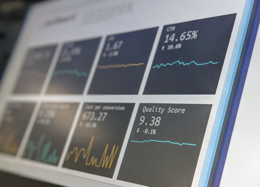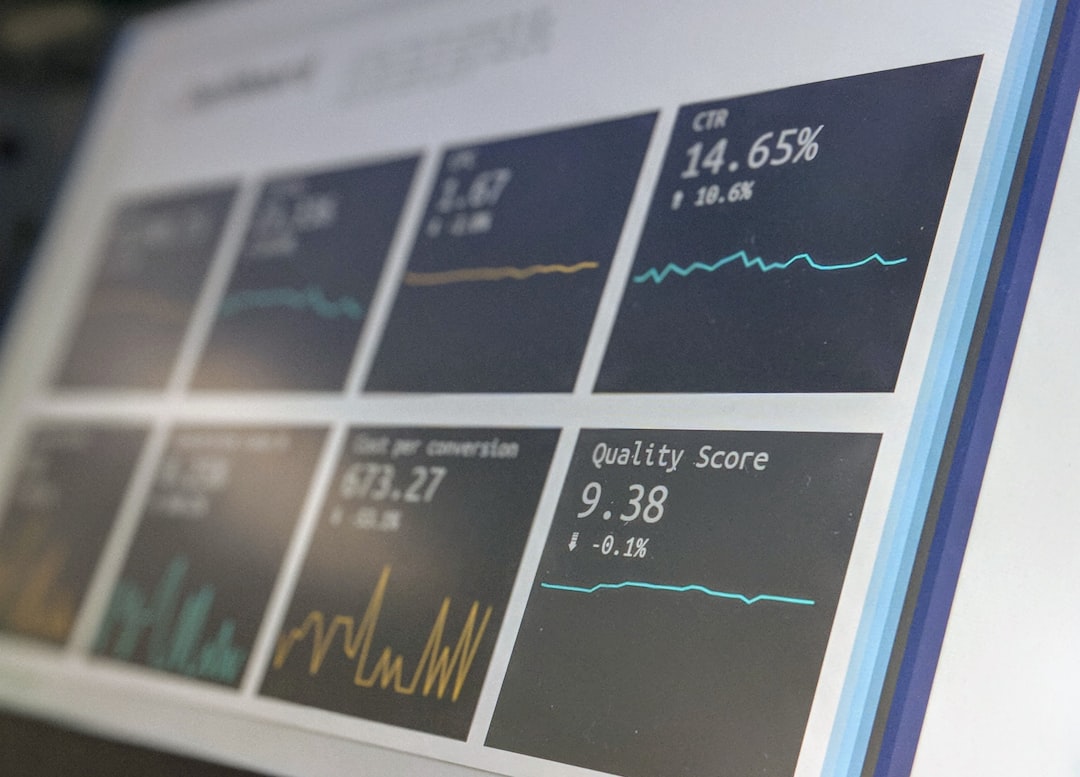


Every European exhibitor with a meaningful fair budget produces some version of a trade-fair report for the executive team, and most of those reports are a dashboard in name only. They fail in predictable ways: too many metrics, no benchmarks, no targets, no per-fair breakouts, and no clear narrative connecting the numbers to the strategic conversation the board actually wants to have.
This article documents the twelve-metric executive dashboard used by experienced European exhibition organisations, what to measure, how to calculate it, what benchmark range to compare against, and how to structure the quarterly board conversation around it.
The frame: the dashboard is not a complete operational view. It is the executive summary that triggers the right strategic conversation. Operational metrics live in the marketing-director view; the executive dashboard distils them.
The twelve metrics organised by executive persona
The dashboard organises around three executive personas, CFO, CRO, CMO, with four metrics each.
CFO-facing metrics: cost and capital efficiency
Metric 1, Fully-loaded fair cost. Total EUR spend including stand build, space rental, exhibitor services, pre-show marketing, travel, accommodation, hospitality, staffing (internal at fully-loaded rate plus external), technology, and post-show effort. Reported per fair and as portfolio total.
Metric 2, Cost per qualified lead. Fully-loaded cost divided by lead count for leads scoring 55 or above. Target range for European tier-one fairs: EUR 280-520. Above EUR 600 indicates either over-investment or under-conversion; below EUR 240 typically reflects under-counting of cost lines.
Metric 3, Pipeline-to-cost ratio. Multi-touch attributed pipeline (12-month window) divided by fully-loaded cost. Target range: 8:1 to 16:1 for best-practice European tier-one fairs. The headline ratio for the CFO conversation.
Metric 4, Closed-revenue-to-cost ratio. Multi-touch attributed closed revenue (12-month window) divided by fully-loaded cost. Target range: 3:1 to 6:1. Reported with explicit acknowledgement that long-cycle deals extend beyond the 12-month window.
CRO-facing metrics: pipeline and conversion
Metric 5, Captured lead volume. Total qualified leads captured at the fair (excluding sub-30-score leads). Reported per fair with year-over-year comparison.
Metric 6, Pre-booked meeting volume and ratio. Total pre-booked meetings completed at the fair, and ratio of pre-booked to walk-in leads. Target ratio for tier-one fairs: 0.15-0.30. Pre-booked meetings convert to pipeline at 2.5-4x the rate of walk-in conversations.
Metric 7, Lead-to-opportunity conversion rate. Percentage of captured leads that convert to qualified opportunities within 90 days post-fair. Target range: 16-24 percent for tier-one fair captures with good follow-up discipline.
Metric 8, Opportunity-to-closed-won win rate on fair-sourced pipeline. Percentage of fair-sourced opportunities that close-won within 12 months. Target range: 24-38 percent for B2B tier-one fair pipeline.
CMO-facing metrics: channel performance and brand
Metric 9, Cost per pre-booked meeting. Pre-show marketing cost divided by pre-booked meeting count. Target range: EUR 180-340. The headline pre-show ROI signal.
Metric 10, Post-show 72-hour SLA adherence. Percentage of captured leads that received Touch 1 within 4 hours and Touch 2 (for 75+ score leads) within 24-48 hours. Target: 95 percent+.
Metric 11, Self-reported source attribution. Percentage of new opportunities self-reporting the fair as a source of first awareness or qualifying interaction. Validates CRM-side attribution.
Metric 12, Brand and social impressions during fair window. Earned and owned media impressions during the fair-week window. Supplements pipeline metrics with the brand-investment view that many fairs serve in addition to direct pipeline.
Dashboard layout
The dashboard fits on a single board slide with three columns, four rows.
| CFO metrics | CRO metrics | CMO metrics | |
|---|---|---|---|
| 1 | Fully-loaded cost (EUR) | Captured lead volume | Cost per pre-booked meeting (EUR) |
| 2 | Cost per qualified lead (EUR) | Pre-booked meeting volume/ratio | Post-show 72-hour SLA (%) |
| 3 | Pipeline-to-cost ratio | Lead-to-opportunity rate (%) | Self-reported attribution (%) |
| 4 | Closed-revenue-to-cost ratio | Opportunity-to-closed-won (%) | Brand/social impressions |
A second slide breaks down each metric per fair within the portfolio, supporting drill-down questions during the executive discussion.
Benchmark ranges for each metric
The benchmark ranges below are calibrated from CEIR, UFI, AUMA, and McKinsey events-practice published research for European B2B tier-one fairs. They represent best-practice performance, not industry averages.
| Metric | Best-practice range | Underperforming threshold |
|---|---|---|
| Fully-loaded fair cost | n/a (absolute number) | n/a |
| Cost per qualified lead | EUR 280-520 | Above EUR 700 |
| Pipeline-to-cost ratio | 8:1 - 16:1 | Below 5:1 |
| Closed-revenue-to-cost ratio | 3:1 - 6:1 | Below 1.8:1 |
| Captured lead volume (100 sqm) | 600-1,000 | Below 450 |
| Pre-booked meeting ratio | 0.15 - 0.30 | Below 0.08 |
| Lead-to-opportunity rate | 16-24% | Below 10% |
| Opportunity-to-closed-won | 24-38% | Below 16% |
| Cost per pre-booked meeting | EUR 180-340 | Above EUR 480 |
| Post-show 72-hour SLA | 95%+ | Below 80% |
| Self-reported attribution | Within 15-25% of CRM attribution | Divergence above 35% |
| Brand/social impressions | Fair-specific | n/a |
“The CEIR exhibitor benchmarks consistently show a 3x to 5x gap between best-practice and average European tier-one exhibitors across these metrics. The gap is not about budget; it is about operational discipline in pre-show marketing depth, on-stand qualification quality, and post-show follow-up SLA adherence.”, Center for Exhibition Industry Research (CEIR), exhibitor benchmarking commentary, 2024
Quarterly review structure
The quarterly executive review for the trade fair portfolio runs roughly 60 minutes with the following agenda:
Minutes 0-10, Portfolio summary. The twelve-metric dashboard. Headline narrative: are we on track against the agreed targets?
Minutes 10-25, Per-fair detail. Drill into the two or three fairs with the largest variance from target, both over-performance and under-performance.
Minutes 25-40, Decisions required. Which fairs warrant continued investment? Which need operational changes? Which should leave the calendar?
Minutes 40-55, Next-quarter outlook. Upcoming fair calendar, expected investments, target metrics for the next reporting cycle.
Minutes 55-60, Wrap-up. Action items, owners, follow-up cadence.
The discipline of this 60-minute structure is that it forces decisions, not just reporting. A dashboard that prompts no decisions is a dashboard that adds no executive value.
Per-fair scorecard detail
The second slide of the dashboard shows per-fair detail. The structure is rows for each fair in the portfolio, columns for the twelve metrics.
| Fair | Cost (EUR) | CPL (EUR) | Pipeline ratio | Closed ratio | Lead vol | Meeting ratio | L-to-O (%) | Win rate (%) | CPPM (EUR) | SLA (%) | Self-attr (%) | Impressions |
|---|---|---|---|---|---|---|---|---|---|---|---|---|
| Hannover Messe | 434K | 312 | 18.9:1 | 5.9:1 | 904 | 0.21 | 17.3% | 28.8% | 245 | 96% | 22% | 4.2M |
| EuroShop | 380K | 296 | 18.0:1 | 5.4:1 | 812 | 0.24 | 19.1% | 31.2% | 210 | 94% | 24% | 3.6M |
| Light+Building | 290K | 388 | 16.0:1 | 4.6:1 | 622 | 0.18 | 16.8% | 26.4% | 280 | 93% | 21% | 2.4M |
| Anuga (year n-1) | 360K | 318 | 16.8:1 | 5.1:1 | 798 | 0.22 | 18.4% | 27.6% | 230 | 97% | 23% | 3.1M |
| Regional fair 1 | 95K | 412 | 14.0:1 | 4.2:1 | 268 | 0.12 | 14.6% | 22.8% | 340 | 88% | 18% | 0.8M |
| Regional fair 2 | 65K | 580 | 8.9:1 | 2.6:1 | 124 | 0.06 | 9.4% | 18.2% | 540 | 78% | 14% | 0.4M |
The Regional fair 2 row is the candidate for management attention: cost per qualified lead is above the EUR 480 underperforming threshold, pipeline ratio is below 10:1, lead-to-opportunity rate is below 10 percent, SLA adherence is below 80 percent. The combination triggers the calendar-decision conversation.
“The portfolio view exposes which fairs are quietly destroying budget that should be reallocated. Most European exhibitors have one or two fairs on the calendar that have not justified themselves for three or four cycles, kept on the schedule because of historical commitment rather than current performance. The dashboard makes the case for removal visible.”, UFI Global Exhibition Barometer, portfolio-management commentary, 2025
Year-over-year trend reporting
The third slide of the dashboard shows year-over-year trend lines for the four highest-priority metrics: pipeline-to-cost ratio, cost per qualified lead, lead-to-opportunity rate, and 72-hour SLA adherence. The trend slide is what builds executive confidence in the methodology over time. A point-in-time number can be questioned; a multi-year trend in a specific direction is harder to dismiss.
Trends to watch:
- Improving pipeline ratio with stable cost per qualified lead: operational improvement in conversion.
- Improving pipeline ratio with rising cost per qualified lead: investment paying off through higher-quality leads.
- Declining pipeline ratio with falling cost per qualified lead: lower-quality leads, conversion is breaking down.
- Stable pipeline ratio: the channel is performing consistently; budget defence rests on year-over-year direction.
Data sources for each metric
The metrics draw from multiple data sources and require cross-system integration:
| Metric | Primary source | Cross-validation |
|---|---|---|
| Fully-loaded cost | Finance ledger + fair-budget tracker | Marketing-ops cost capture |
| Cost per qualified lead | Cost / CRM lead count by score | n/a |
| Pipeline ratio | CRM attribution / cost | Self-reported source field |
| Captured leads | Capture app integration → CRM | Organiser scanner export |
| Pre-booked meetings | Calendar tool (Calendly, Chili Piper) | Sales-team confirmation |
| Lead-to-opportunity | CRM stage progression | Sales-team review |
| Win rate | CRM closed-won by fair-source tag | n/a |
| Cost per pre-booked meeting | Pre-show marketing cost / meetings | n/a |
| 72-hour SLA | Sales engagement platform timestamps | CRM activity logs |
| Self-reported attribution | Form question on demo-request | Quarterly cross-check vs CRM |
| Brand impressions | Earned-media monitoring tool | Social platform analytics |
The CRM is the central source for most metrics. Capture-app and sales-engagement-platform integrations feed the CRM with the event-level data that supports the metrics. Without these integrations, the dashboard cannot be produced at quarterly cadence.
Tooling for dashboard automation
The dashboard should be automated, not assembled manually each quarter. Manual assembly creates two failure modes: late delivery (often 4-8 weeks post-quarter, by which time the conversation has moved on) and inconsistent methodology (each quarter’s manual rebuild risks subtle calculation drift).
| Component | Tooling examples |
|---|---|
| Data extraction from CRM | Native CRM reports, Salesforce Reports, HubSpot Reports |
| Data integration | Fivetran, Stitch, Hightouch, Zapier, native connectors |
| Analytics warehouse | Snowflake, BigQuery, Redshift, native CRM warehouse |
| Dashboard layer | Looker, Tableau, Power BI, Sigma, native CRM dashboards |
| Distribution | Scheduled PDF export, embedded in board-pack tool |
For mid-size European exhibitors, native CRM dashboards (HubSpot, Salesforce) plus a simple analytics warehouse and Looker or Tableau layer covers 95 percent of the dashboard automation requirement. Enterprise exhibitors with multiple business units and complex attribution typically run dedicated business-intelligence stacks with attribution tooling like Adobe Marketo Measure or Dreamdata.
Common dashboard failures
- Too many metrics. Twenty-metric dashboards produce dashboard fatigue and obscure the headline narrative.
- No benchmarks. Numbers without targets prompt no decisions.
- No year-over-year trend. Point estimates are easier to dispute than trends.
- Manually assembled. Late delivery, inconsistent methodology, eventually abandoned.
- No per-fair breakout. Portfolio totals hide the underperforming fairs.
- No CFO sign-off on methodology. Attribution disputes during the meeting derail the strategic conversation.
- Missing the brand metrics. Pipeline-only dashboards miss the substantial brand-investment role that some fairs serve.
Integration with the broader strategy
The dashboard is the reporting layer for the ROI measurement methodology and the budget defense framework.
It depends on data from the lead capture systems playbook, the lead qualification and scoring framework, and the post-show follow-up execution. It informs objective setting for the next cycle.
For deeper coverage of adjacent topics, see our exhibition strategy hub, our pre-show marketing playbook, our account-based event marketing framework, our builders directory, and our RFQ tool.
References
- Center for Exhibition Industry Research (CEIR). Exhibitor Performance Benchmarks. 2024 wave.
- UFI Global Exhibition Barometer, 2025 wave. KPI and benchmarking practice.
- AUMA exhibitor guidance on reporting standards, 2024-2025.
- McKinsey & Company Events Practice. “KPI Frameworks for B2B Event Marketing.” 2024.
- Harvard Business Review. “The Marketing Dashboard the Board Will Actually Read.” HBR Marketing, June 2024.
- Bain & Company. “Why Most Marketing Dashboards Fail.” Bain Insights, March 2024.
- Forrester Research. B2B Marketing Performance Measurement. 2024 framework.
- SiriusDecisions. Event Marketing KPI Framework. 2024 edition.
FAQFrequently asked questions
Five metrics under-describes a complex channel with cost, conversion, quality, and timing dimensions; twenty metrics produces dashboard fatigue and obscures the signal. Twelve metrics maps cleanly to a three-column board slide (four metrics per column) covering investment, output, and quality.
The twelve also covers the three executive personas with different information needs: the CFO wants cost and ratio metrics; the CRO wants pipeline and conversion metrics; the CMO wants channel performance and brand metrics. Twelve metrics in a single dashboard satisfies all three without forcing redundant briefings.
Both, in a layered view. The headline slide shows portfolio totals across the twelve metrics for the executive conversation. A second slide shows per-fair breakouts for the same twelve metrics, supporting drill-down questions during the board discussion. The portfolio view drives strategic conversation; the per-fair view supports tactical conversation. Showing only portfolio data invites questions the dashboard cannot answer; showing only per-fair data buries the headline narrative in detail.
Quarterly for the full twelve-metric review with executive attendance; monthly for marketing-director internal review against the same metrics; weekly during active fair-week and follow-up periods for the metrics that move daily (SLA adherence, lead capture rate, follow-up conversion).
The cadence matters: quarterly reviews establish the strategic trajectory but are too infrequent to catch operational drift; weekly reviews catch operational drift but consume executive time disproportionately. The layered cadence balances the two.
Start with CEIR and UFI benchmark ranges for the first cycle, then calibrate against your own performance after each fair. The first-cycle targets should be set at the mid-point of best-practice benchmarks for similar exhibitor profiles. After two or three fair cycles, the targets should reflect your own demonstrated performance plus a stretch margin (typically 8-15 percent year-over-year improvement on key metrics).
The discipline is to commit to specific numeric targets before the fair, not to declare retrospective success after the fair against vague goals.
Two metrics serve the CFO conversation primarily: cost per qualified lead (fully-loaded cost divided by leads scoring 55+) and pipeline-to-cost ratio with the agreed multi-touch attribution applied. These two metrics anchor the cost discipline conversation. The remaining ten metrics support the CRO and CMO conversations or provide operational context.
CFOs who try to monitor all twelve metrics lose focus; CFOs who monitor the two anchor metrics quarterly maintain effective oversight without crowding out their other responsibilities.
Report the fair on the dashboard with its actual metrics, including the underperformance. Underperforming fairs are signals that warrant decision: either operational improvement (better pre-show, better follow-up, better staffing) or removal from the calendar.
Hiding underperformance protects the marketing team’s short-term reputation at the expense of long-term credibility with executives, who will eventually notice that some fairs never appear on the dashboard. Transparency about underperformance builds executive trust in the dashboard methodology, which is the prerequisite for budget defence on the next cycle.